Skip to content

Editor field description for the Google calendar

Integrates the external Google Calendar into a page with various options, e.g. to customise the appearance.

Title
(Text input)
The title / headline for this content.
A value has to be entered in this field.
Calendar configuration
In the calendar configuration it is possible to change the default calender settings.
Calendar id
(Text input)
The calendar id is the address for your calendar. Please take this id from your Google account.
Calendar title
(Text input)
The calendar title is the direct headline for the calendar.
View
With the parameters in the view is it possible to activate or deactivate some parts of the calendar.
Title
(Check box)
This sets if the calendar title is shown in the calendar head.
Navigation buttons
(Check box)
This sets if the navigation buttons in the calendar head are active.
Date
(Check box)
This sets if the date is shown in the calendar head.
Printicon
(Check box)
This sets if the print icon is shown in the calendar head.
Tabs
(Check box)
Sets if the tabs to change between the calendar views for week, month and agenda are shown.
Calendar list
(Check box)
This sets if the selection of the calendar list is active.
Timezone
(Check box)
This sets if the timezone is shown in the calendar foot.
Default view
(Select box)
This sets the default view: week, month or agenda.
Height
(Combo box)
Sets the height of the calendar. The values are given in pixels.
Week starts on
(Select box)
This sets on which day of week the calendar week starts.
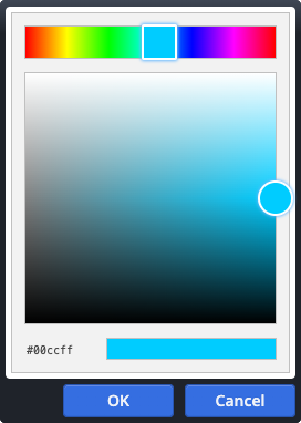
Background color
(Color picker)
This sets the background color from the calendar head.
The colour code must be in the correct hexadecimal format, e.g. in the form ‘#CC3300’.
Border
(Check box)
This sets if the calendar is surrounded by a thin border (1px).
Preview (Code only activated after click)
Optional

If this option is activated, a preview is shown instead of the real content first.

The HTML code of the element is not directly loaded.

The user must click on the preview to load the real element code.

This can improve data protection for the user.
Notice
(Text input)

Will be displayed on top of the preview.

A value has to be entered in this field.
Additional notice
(Text input)
Optional

Will be displayed as additional notice at the bottom of the preview.

Preview image
(Image gallery)
Optional

Image displayed as preview for the real content.

Image format
(Select/combo box)
Optional

Allows you to set the image size based on common formats.

The image will automatically be scaled so that the original pixels are best fitted to the selected target format.

Instead of the presets, you can also manually enter any format. Use "width-height", for example "5-1" for an extreme wide format.

Icon overlay
(Select/combo box)
Optional

The selected icon is displayed as overlay above the preview.

In addition to the predefined options, any icon name from the Mercury template can be entered, e.g. 'bi-heart-fill'.

For the full list of possible icons, see the Mercury documentation website.

Background color
(Color picker)
Optional

Sets the background color of the preview.

Used only if no preview image has been set.

The colour code must be in the correct hexadecimal format, e.g. in the form ‘#CC3300’.
Gallery title
(Text input)
Only Workplace users
Optional
Used to identify this content in the OpenCms internal gallery. Not shown in the output page.