Skip to content

Editor field description for the Form

The form creates an interactive mask where entries can be sent by e-mail or saved in a database.

Tab "Form page"

Configures texts and behaviour of the shown form page.
Title
(Text input)
The title of the input form.
Form text
(HTML editor)
Text displayed above the input form.
Form middle text
(HTML editor)
Optional
Text displayed below the input form.
Form footer text
(HTML editor)
Optional
Text displayed below the submit button.
Confirmation text
(HTML editor)
Text displayed on the form confirmation page.
Captcha Field
Optional
Label
(Text input)
The label for the captcha field.
Preset
(Select box)
Optional
Choose the grade of deformation of the captcha image.
Release Date
Optional
Date
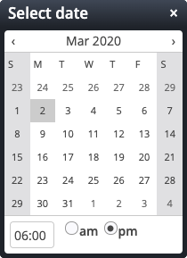
(Date / time selection)
Specifies the date when the form will be released.
Released text
(HTML editor)
The entered text will be displayed instead of the form when the form has not yet been released.
Expiration date
Optional
Date
(Date / time selection)
Specifies the date when the form will be disabled.
Expiration text
(HTML editor)
The entered text will be displayed instead of the form when the form is expired.
Advanced configuration
Optional
Enable form check page
(Check box)
If enabled, an additional check page is shown before finally submitting the form data.
Check page text
(HTML editor)
The text displayed above the values on the check page.
Enable mandatory marks
(Check box)
If enabled, the mandatory marks and the mandatory notes are shown in the form.
Enable reset button
(Check box)
If enabled, the reset button will be shown on the form page.
HTML template file
(File selection)
Optional
Path to a specific HTML template file for this form.
Action class
(Text input)
Optional
The action class for this form to implement action which is executed after the webform data are saved/sent.
Refresh session
(Text input)
Optional
If active, the time (in seconds) can be specified to refresh the session while the web form is displayed.
Target URI
(File selection)
Optional
After sending an email, instead of showing a confirmation page, the user gets immediately redirected to this internal URI after the form has been successfully submitted.
Use forward
(Check box)
Optional
Instead of redirecting to the target URI, the request is forwarded to the target URI.
Instant redirect
(Check box)
Optional
Instantly redirect to the specified target URI after form submission.

Tab "Inputs fields"

Defines the shown fields of the form.
Form field
Can occur as often as necessary
Type
(Select box)
The type of the input field.
Label
(Text input)
The label text for the input field.
A value has to be entered in this field.
Mandatory
(Check box)
If checked, this input field has to be filled out, otherwise it is optional.
Default value
(Text input)
Optional
The initial default value of the input field or the list of shown options for checkboxes, radio buttons and select boxes.
Parameters
(Text input)
Optional
Parameters for enhanced input field configuration, written as key=value pairs separated by a pipe | symbol.
Validation
(Text input)
Optional
Regular expression used to validate the submitted field value.
Error Message
(Text input)
Optional
A custom error message if validation of this field failed.
Text between fields
Optional - Can occur as often as necessary
Field label
(Dependent select box)
The label of the input field below which the text is shown.
Text column
(Select box)
The column where the text is shown, left, right or both.
Text
(HTML editor)
This text is shown below the selected input field.

Tab "Dependent fields"

With dependent fields it is possible to define fields which are shown if an input field (usually a select box or radio buttons) has a specific value.
Dependent field(s)
Optional - Can occur as often as necessary
Field label
(Dependent select box)
The label of the input field the following fields are dependent from.
Field value
(Text input)
The necessary value of the input field. The dependent fields are only shown if the field has the value entered here.
A value has to be entered in this field.
Dependent field
Can occur as often as necessary
Definition of a dependent input field.
Type
(Select box)
The type of the input field.
Label
(Text input)
The label text for the input field.
A value has to be entered in this field.
Mandatory
(Check box)
If checked, this input field has to be filled out, otherwise it is optional.
Default value
(Text input)
Optional
The initial default value of the input field or the list of shown options for checkboxes, radio buttons and select boxes.
Parameters
(Text input)
Optional
Parameters for enhanced input field configuration, written as key=value pairs separated by a pipe | symbol.
Validation
(Text input)
Optional
Regular expression used to validate the submitted field value.
Error Message
(Text input)
Optional
A custom error message if validation of this field failed.

Tab "Email configuration"

Set the sender and receiver addresse(s) for the notification email. Additional options for sending the mail can be configured.
Email type
(Select box)
Optional
The type of the generated email can either be Plain text or a HTML formatted. Default is HTML.
Email sending address
(Text input)

The address used to send the administrative email.

Thus must be set to a valid email address.

A value has to be entered in this field.
Email reply-to address
(Text input)
Optional

The address to which the recipient of the mail should reply to.

Thus must be set to a valid email address.

Email sending name
(Text input)
Optional
The "real" name that is displayed when sending the email.
Administrative email recipient
(Text input)

The recipient(s) for all administrative notification emails.

Use a semicolon to separate multiple recipients.

A value has to be entered in this field.
Administrative email CC
(Text input)
Optional

The email CC recipient(s).

These receive a copy of all administrative emails.

Use a semicolon to separate multiple recipients.

Administrative email BCC
(Text input)
Optional

The email BCC recipient(s).

These receive a copy of all administrative emails.

Use a semicolon to separate multiple recipients.

Administrative email subject
(Text input)
The subject / headline for the administrative email.
A value has to be entered in this field.
Administrative email text
(HTML editor)
Optional

The text of the generated email.

The following macros can be used:

%(content.Title) for the title of the form (or event)
%(formdata) for a table of the form values
%(date) for the date when the email was send

For bookable events the following additional macros are available:

%(event.time) for the date / time of the booked event
%(event.note) for the optional note of the booked event
%(event.type) for the optional type or number of the booked event
%(event.waitlist.info) for information about the waitlist status (if required)

In addition to this, all data entered by the user in a configured form field can be displayed in the email. For example, if a form field First name has been configured, it's value can be displayed using %(First name).

Email custom CSS
(Text area)
Optional

A custom CSS ruleset used for all generated emails.

If not set, a default CSS ruleset is used.

Confirmation emails for the user
Optional
Options to send emails to the user who submitted the form.
Form field that contains the user email
(Dependent select box)

The label of the form field where the user has to enter the email address.

The field type must be Email field.

Confirmation email sending address
(Text input)
Optional

The address used to send the confirmation email.

Thus must be set to a valid email address.

A value has to be entered in this field.
Confirmation email reply-to address
(Text input)
Optional

The address to which the user should reply to in the case of questions.

Thus must be set to a valid email address.

A value has to be entered in this field.
Confirmation email sending name
(Text input)
Optional
The "real" name that is displayed when sending the email.
Enable confirmation email
(Check box)
Enables sending of a confirmation email to the user who submitted the form.
User selectable confirmation email
(Check box)

The user can decide to receive a confirmation email or not.

A checkbox is shown on the generated form for this.

Text to show in case of user selectable confirmation email
(Text input)
Optional

The text to show with the checkbox in case the user can select to receive a confirmation email.

A default text will be used if not set.

Confirmation email subject
(Text input)
The subject of the confirmation email.
Confirmation email text
(HTML editor)
Optional

The text of the generated email.

The following macros can be used:

%(content.Title) for the title of the form (or event)
%(formdata) for a table of the form values
%(date) for the date when the email was send

For bookable events the following additional macros are available:

%(event.time) for the date / time of the booked event
%(event.note) for the optional note of the booked event
%(event.type) for the optional type or number of the booked event
%(event.waitlist.info) for information about the waitlist status (if required)

In addition to this, all data entered by the user in a configured form field can be displayed in the email. For example, if a form field First name has been configured, it's value can be displayed using %(First name).

Show iCalender link
(Check box)
Optional
If checked, an iCalender link will be shown in the mails sent to the user.
Reminder email for registered users
Optional

Basic settings for the optional reminder email for registered users.

The reminder email must also be activated in the booking configuration of the individual event.

Subject
(Text input)
Optional

The subject / headline for the reminder email.

If nothing is specified, an automatic subject is used.

Text
(HTML editor)
Optional

The text for the reminder email.

The following macros can be used:

%(content.Title) for the title of the event
%(event.time) for the date / time of the booked event
%(event.note) for the optional note of the booked event
%(event.type) for the optional type or number of the booked event
%(reminder.interval) for the number of days until the event starts specified in the event configuration
%(reminder.note) for the additional note in the reminder email specified in the event configuration

In addition to this, all data entered by the user in a configured form field can be displayed in the email. For example, if a form field First name has been configured, it's value can be displayed using %(First name).

If nothing is specified, an automatic text is used.

Tab "Database configuration"

Configure if and how form data is stored as XML content and exported.
Database configuration
Optional
Add a database configuration to store submitted form data in XML contents.
User
(Text input)
The user given here is the system user that writes the form data contents.
Guests only
(Check box)
Optional
If selected, the user given above is used to write the form data contents only if the form is submitted by a guest user.
Group
(Group selection)
Optional
Group of users that manages the submitted data. Only members of that group can see the folder with the submitted data.
Content folder
(Text input)
Optional
Usually, you do not specify the folder. It is automatically determined. If you really want to choose a folder manually, type the root path of that folder. To get things working correctly (including publication and permissions), point to a currently non-existing sub-folder of a published (and unchanged) folder.
Available datasets
(Text input)
Optional
Please choose a number between 1 and 9999.
Length of the waiting list
(Text input)
Optional
Please choose a number between 1 and 9999.
Registrations added otherwise (reduces the available datasets)
(Text input)
Optional
Please choose a number between 1 and 9999.
Dataset titles
(Text input)
Title property of the datasets. It should contain macros "%(field label)" to map submitted data to the title property.
Delete registrations after event (days)
(Text input)
Optional

The number of days after the event when registrations should be deleted.

This requires a scheduled job.
Group booking
Optional
Group booking allows to register more than one participant at once.
Input Field Group Size
(Dependent select box)
Input field in which the number of participants is entered. The validation is overwritten for the field and the field is rendered as a text field.
Max. Group Size
(Text input)
The maximum number of participants that can be registered at once.
Please choose a number between 1 and 99.
Database export
Optional
Add a configuration to specify how saved form data is exported.
Global settings
Export event information
(Check box)
Export booking information
(Check box)
Export the active registrations only without the cancellations
(Check box)
Always one line per registration (also for groups)
(Check box)
If this option is activated, always only one line is exported for each registration.
System fields
Optional
Add field
(Select box)
Can occur up to 4 times
Fields to ignore
Choice
Optional
List of fields to be ignored during export.
Choice option 1
Ignore input field
(Dependent select box)
Optional
Choice option 2
Ignore dependent field
(Dependent select box)
Optional
Choice option 3
Ignore former field
(Text input)
Optional
Rename or merge field
Optional - Can occur as often as necessary
Specify an export column name for a field. If multiple fields have the same export column name, field values are merged.
Input field (Label)
(Text input)
Export column name
(Text input)